Vaarn Atlas
Improving Readability
Vaarn Atlas » Devlog
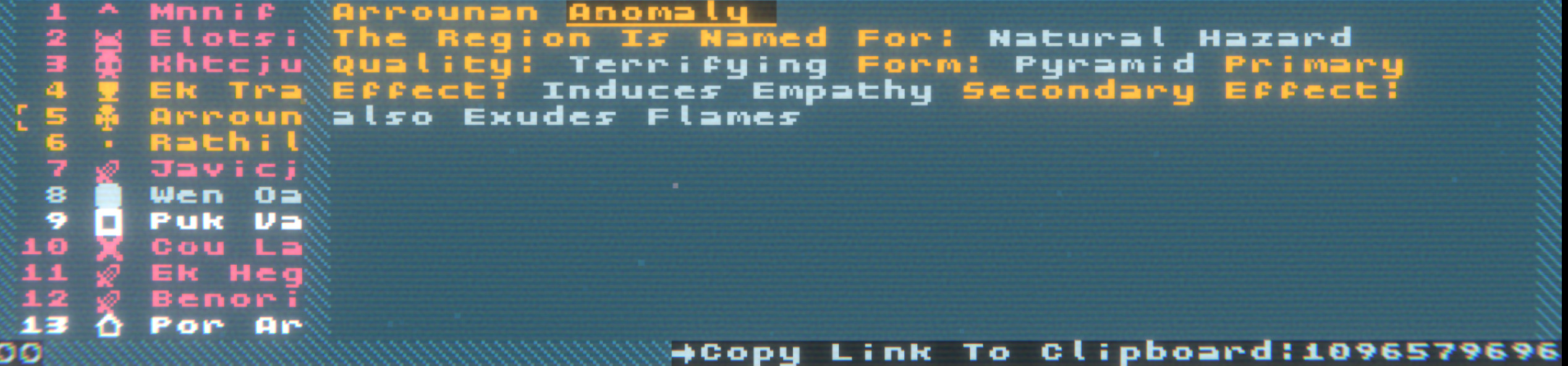
I've gotten a bit of feedback about the readability of the Atlas. One issue was the large quantity of linebreaks. I've tried to improve that and make larger textboxes in this update. I'm also planning on adding an optional more readable font. It will still have to be monospaced, and it may not match well with the aesthetics, but it should be more readable.
Let me know if there are any other accessibility features that you would like me to add! I will do my best to add them.
Vaarn Atlas
A Random Map Generator For Vaults Of Vaarn
| Status | In development |
| Category | Tool |
| Author | Jacob Marks |
| Genre | Role Playing |
| Tags | ascii, Generator, OSR, Post-apocalyptic, Procedural Generation, Roguelike, Sci-fi, Tabletop role-playing game, vaarn |
| Languages | English |
| Accessibility | Color-blind friendly, High-contrast |
More posts
- Gnomon Generator, and other featuresMar 12, 2022
- Improving Cursor FollowingFeb 19, 2022
- It is published!Feb 18, 2022
Leave a comment
Log in with itch.io to leave a comment.